Robyn Stacey | Kiss Kiss Bang Bang
enquire about this work
enquire about this work
enquire about this work
enquire about this work
enquire about this work
enquire about this work

enquire about this work
enquire about this work
enquire about this work
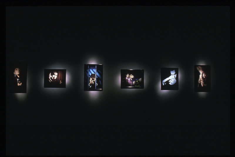
KISS KISS BANG BANG
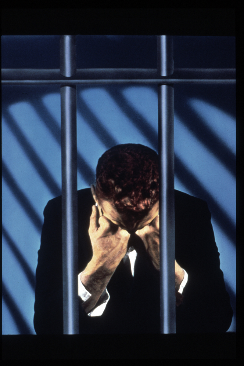
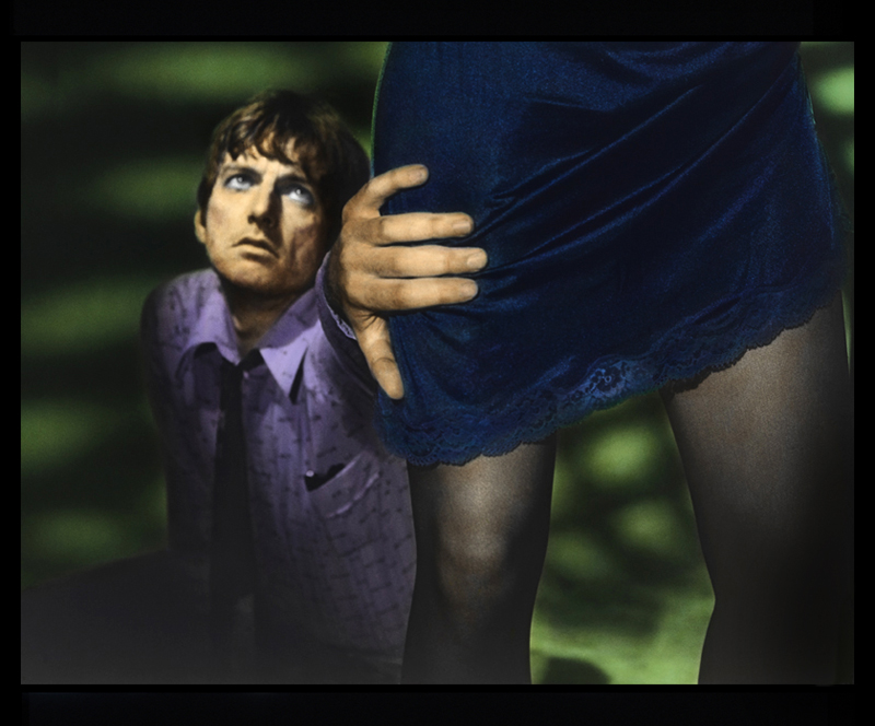
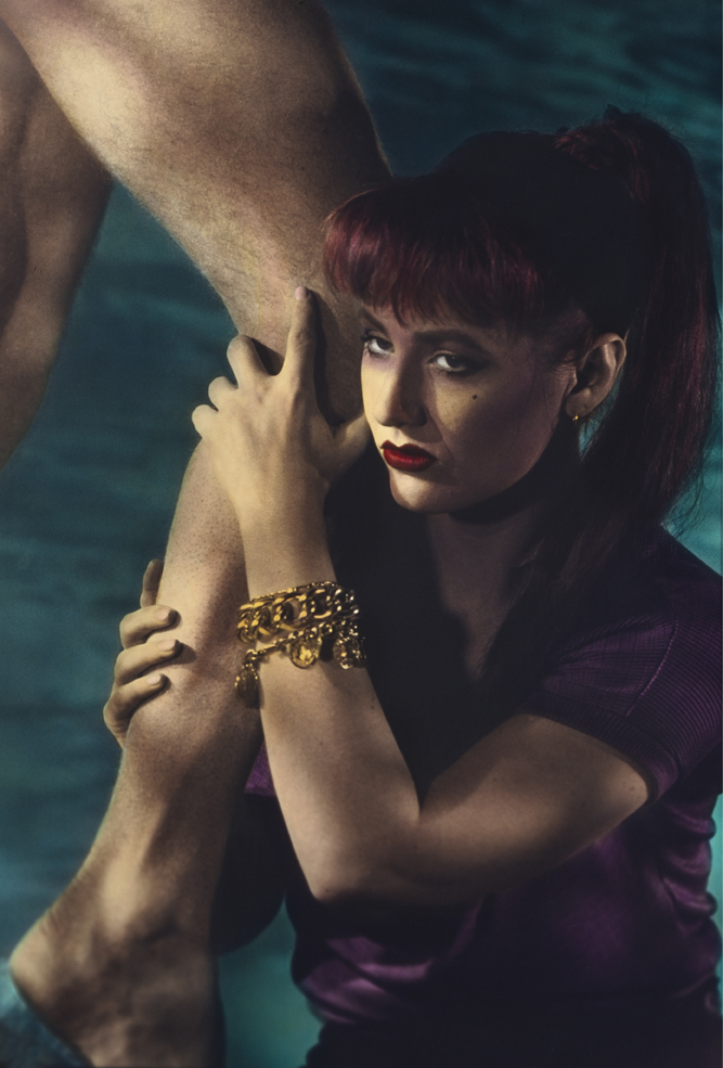
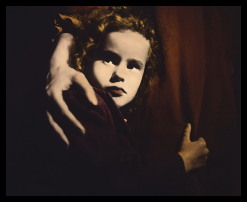
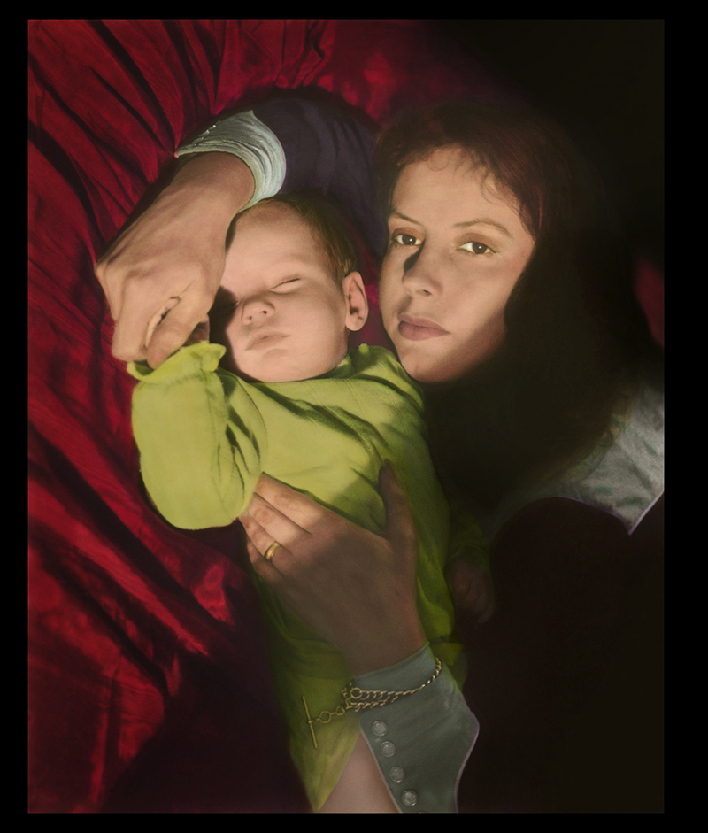
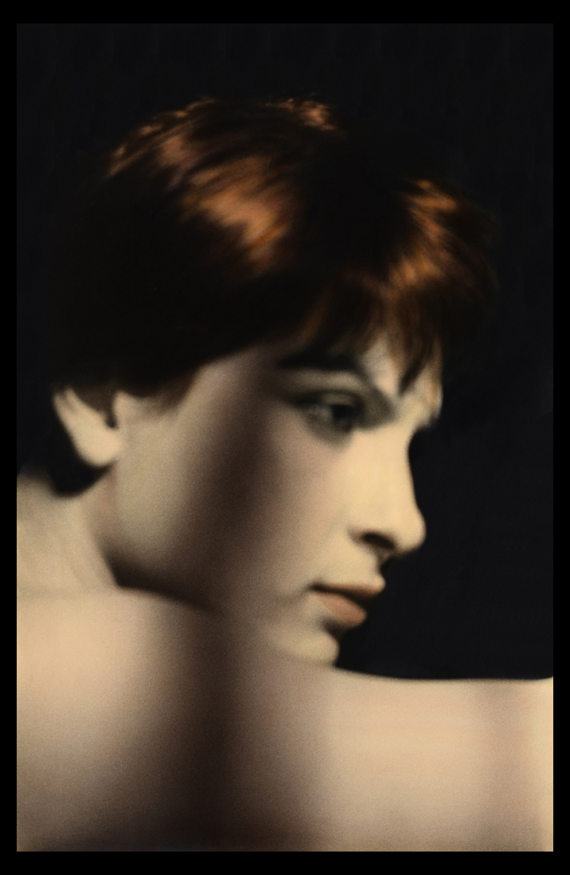
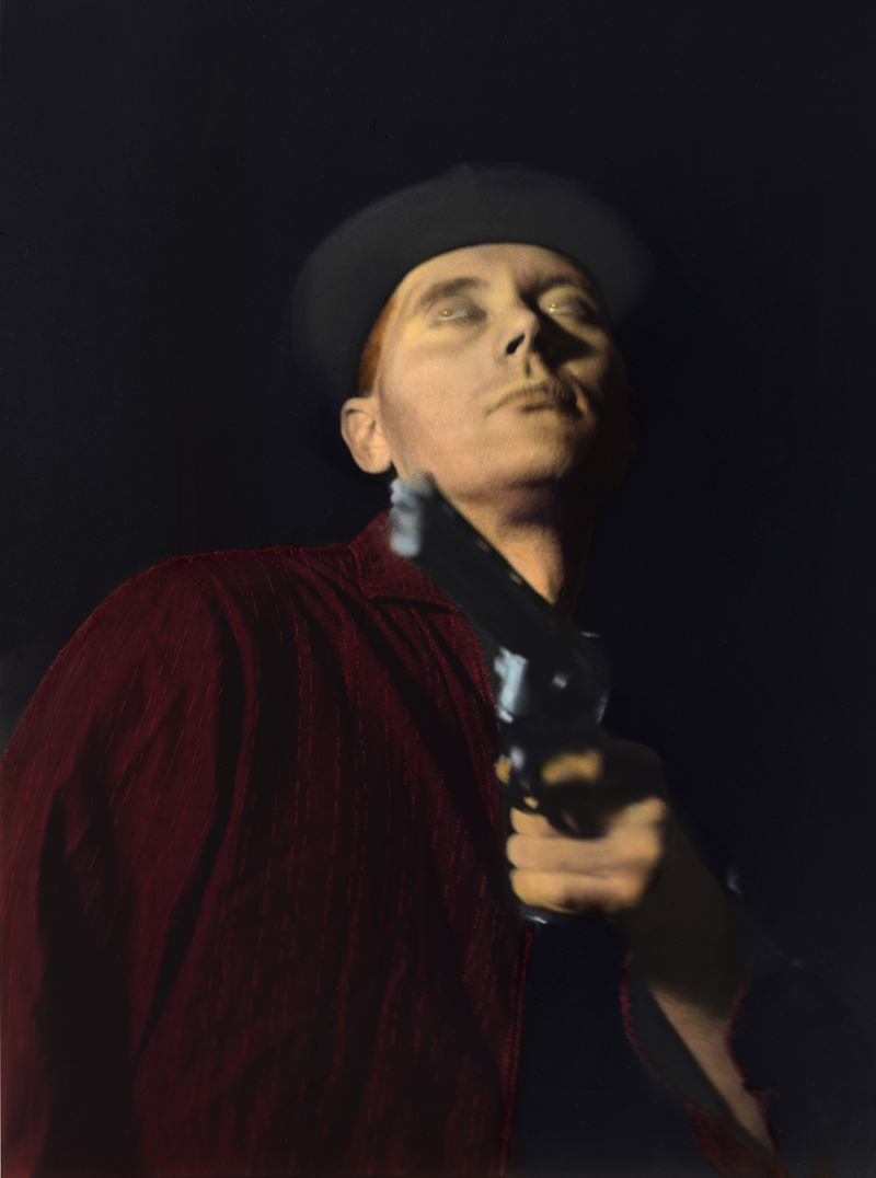
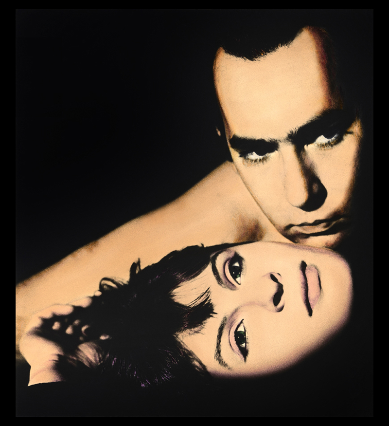
This series, has its origin in Pulp paper back covers, 80’s Postmodernism and Punk.
Pulps as the name suggests were cheaply printed, disposable paperbacks, characterised by great illustrations (mostly photographically based), bold graphics and lurid colour. Published from 1896 until the 1950s, the typical pulp magazine was seven inches wide (18cm) by ten inches high (25cm), half an inch thick (1cm), and 128 pages long. Pulps were predominantly American, although France developed its own take on this hard-boiled literature termed serie noir. Many respected writers authored Pulps; Dashiel Hammet, Raymond Chandler, Erle Stanley Gardner and Cornell Woolrich to mention a few.
Australia was in thrall to Postmodernism in the 80’s and its rejection of the distinction between "high" and "low" art. Ignoring genre boundaries, the movement encouraged the mix of ideas, medias, and forms to promote parody, humour, and irony. Punk with its ethos of ‘fuck expertise, just do it’ inspired and animated the contemporary music and art scene. These three components produced a heady mix that influenced me when making Kiss Kiss Bang Bang.
I had read most of the Pulp writers and loved the fatalistic, compressed almost surreal style of writing. The protagonists are powerless in the face of events, which are unrelenting, merciless, and fast paced. It is always the wrong time, wrong place, and wrong company.
The female protagonists, represented the archetypical tough, capable woman, the opposite of the kindly school teacher or long suffering girl friend waiting paitently in the wings. These women were clever and often desperate and the series plays on the ambiguity of the role of women in Pulps, in which they are cast as both treacherous femme fatales, yet also as victims.
The subjects in the images were not professional models but friends. I used an old Roliflex medium format camera and photographed the subjects in my studio using black and white film. I then hand coloured the black and white prints, I was very keen on hand colouring at the time as hand-colouring photographs had been considered women’s work since the birth of photography in the early nineteenth century. The hand coloured prints were then re-photographed onto a 5X4 transparency which were printed onto gloss cibachrome paper. The cibachrome with its mirror type finish really suited the images, giving another dimension to the hand-colouring, and the super gloss finish suited the ‘bad’ or seedy nature of the characters and the scenarios.
The title, Kiss Kiss Bang Bang, was originally coined by Pauline Kael, the famous cinema critic and writer, to describe noir films. It was later a descriptor attached to James Bond - Mr. Kiss Kiss Bang Bang.
Robyn Stacey
Kiss Kiss Bang Bang

enquire about this work

enquire about this work

enquire about this work

enquire about this work

enquire about this work

enquire about this work

enquire about this work

enquire about this work

enquire about this work

KISS KISS BANG BANG
This series, has its origin in Pulp paper back covers, 80’s Postmodernism and Punk.
Pulps as the name suggests were cheaply printed, disposable paperbacks, characterised by great illustrations (mostly photographically based), bold graphics and lurid colour. Published from 1896 until the 1950s, the typical pulp magazine was seven inches wide (18cm) by ten inches high (25cm), half an inch thick (1cm), and 128 pages long. Pulps were predominantly American, although France developed its own take on this hard-boiled literature termed serie noir. Many respected writers authored Pulps; Dashiel Hammet, Raymond Chandler, Erle Stanley Gardner and Cornell Woolrich to mention a few.
Australia was in thrall to Postmodernism in the 80’s and its rejection of the distinction between “high” and “low” art. Ignoring genre boundaries, the movement encouraged the mix of ideas, medias, and forms to promote parody, humour, and irony. Punk with its ethos of ‘fuck expertise, just do it’ inspired and animated the contemporary music and art scene. These three components produced a heady mix that influenced me when making Kiss Kiss Bang Bang.
I had read most of the Pulp writers and loved the fatalistic, compressed almost surreal style of writing. The protagonists are powerless in the face of events, which are unrelenting, merciless, and fast paced. It is always the wrong time, wrong place, and wrong company.
The female protagonists, represented the archetypical tough, capable woman, the opposite of the kindly school teacher or long suffering girl friend waiting paitently in the wings. These women were clever and often desperate and the series plays on the ambiguity of the role of women in Pulps, in which they are cast as both treacherous femme fatales, yet also as victims.
The subjects in the images were not professional models but friends. I used an old Roliflex medium format camera and photographed the subjects in my studio using black and white film. I then hand coloured the black and white prints, I was very keen on hand colouring at the time as hand-colouring photographs had been considered women’s work since the birth of photography in the early nineteenth century. The hand coloured prints were then re-photographed onto a 5X4 transparency which were printed onto gloss cibachrome paper. The cibachrome with its mirror type finish really suited the images, giving another dimension to the hand-colouring, and the super gloss finish suited the ‘bad’ or seedy nature of the characters and the scenarios.
The title, Kiss Kiss Bang Bang, was originally coined by Pauline Kael, the famous cinema critic and writer, to describe noir films. It was later a descriptor attached to James Bond - Mr. Kiss Kiss Bang Bang.